Monday, October 29, 2012

Forest Practices Unhappiness

Last winter a paper  (Abstract Wittaker and McShane (2012)) suggested that landslide screening tools developed by the DNR were reasonably good at predicting potential slope problems. We also suggested that these tools could be better utilized than they have been. We also made a real effort to recognize that the screening tools available could be and will likely be improved (this is particularly true as LiDAR becomes more utilized). I've encountered some folks that were not happy with that paper. But then I have encountered a few folks that have been unhappy about this:

Slope failures on forest land in southwest Washington
Red dots are my own inventory of slide sites

The paper has given me some perspective on the difficulty of changing policy so messes like the one pictured above are better understood and managed. It has also driven home how sensitive agencies can allow themselves to get.

Sunday, October 28, 2012

First Coal Terminal Scoping Metting: We Are All Wonks Now

I attended the EIS (environmental impact statement) scoping meeting in Bellingham. This was the first meeting since the proposed Cherry Point Coal Terminal submitted final applications. This issue is a huge deal locally in Whatcom County but has global significance as well. The proposal is to build a very large coal export terminal to export United States coal from the Powder River Basin (geologic basin) to China. 

This issue has been and will likely continue to be well covered by media locally and nationally so I have generally left it alone of late on Reading the Washington Landscape unless I have something else to add.

And I should add that I attended as a volunteer to help with organization (follow orders) and to comment on the scope of the EIS regarding train issues and CO2.

One minor drama missed in the media coverage was the booth issue. Opponents of the terminal had been told no rallies, microphones or booths were to be set up on school grounds. Hence, when terminal applicant employees set up a booth some minor drama followed. 

GPT (Gateway Pacific Terminal) set up tents and info booths at 6:30 am

School District informs GP that booths and tents are not allowed

Police follow up saying the tents have to go.

This was really a tough event for these employees. GPT had been running full page adds in the daily paper and radio adds all week, they got up early in the dark to set up booths, and almost no one came in support of the terminal. 

The other pre meeting entertainment was the sign war. Terminal opponents had lined the street with signs. This was followed by a counter sign installation.

Coal terminal opposition lined street with signs

Counter sign installation being documented by AP reporter (and me)

This meeting was heavily attended. An Ecology staff person with a counter counted 1,800 people. Not sure if records are kept regarding EIS scoping meeting, but I would not be surprised if it was a record of some sort. 

Wayne (Whatcom County) directs traffic after lower lot is full

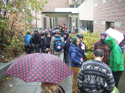
Lined up for the meeting

Waiting to get in

But EIS scoping meetings are not just about numbers (although that does matter). The Scope of the EIS is about substance. And this part of the meeting was truly impressive. I have been through scoping meetings as a citizen, a consultant and as a panelist determining the EIS scope. I have never seen anything as close to the level of of sophistication of EIS scope comments as I witnessed yesterday. The people commenting were not paid experts or paid staff. These are just regular folks that have studied the issues that they believe need to be evaluated in the EIS. Whatcom County has become a bunch of policy wonks.I spoke with a number of people I know that have been through these types of processes and all were equally impressed. We came away proud of our community.

I can not possibly touch on all the comments, but will provide three highlights.

The first speaker

The first speaker spoke about PM 10 and PM 2.5 and health risks associated with diesel emissions. PM? particle emissions and the number refers to particle size. There was a comment much later that brought this issue into more than an abstract concept. With very long trains hauling coal shorter trains with engines running must park at sidings at various locations along the rail route and in some cases this will be right next to where people live. The particulate emissions then turn into an episodic point source for those on nearby properties.

Agency folks listening to comments

Watching the agency folks listening brought back memories. This group appeared attentive and have a long job ahead of them. This was the first scoping meeting. There are nine more at various locations around the State of Washington.

Duane impressed to crowd but also made a very valid point regarding the Scope of the EIS

Duane pointed that the proposal to export huge volumes of coal is counter to the problem that scientific consensus has reached on CO2 and global warming and that this issue must be addressed in the EIS. It is this issue that has turned this terminal proposal into more than a local issue, but a global one.  
  
Lummi witness

A pregnant woman almost always makes for a compelling witness - they are symbolic of the future. This woman though really woke people up. She started out speaking for about 15 seconds in a language other than English. She was spoke Lummi. Her being a "Lummi witness" is a distinction that is critical to how the Lummi People view this project. 

Early on I had noted the PR campaign that had been launched by the terminal proponents
coal-terminal-preemptive-strike. The one thing I conclude definitively regarding the coal terminal proposal is that the PR campaign has not worked. Yes, the usual "build anything" crowd will support this project, but a PR campaign was not needed for that group. But the reality is in the comment session I attended comments that could be categorized as opposed or very concerned was 48-1. 

Friday, October 26, 2012

A Little Political Bias

Our recent experiences can bias our interpretations. I had the feeling I was misunderstanding this painting in Santa Marina Trastavere, a church in Rome.

 
A painting with a very large number of men clearly having an important meeting. And the women outside the meeting doing other stuff. My bias from recent events in the United States caused me to think that perhaps this was an early feminist statement about men making decisions about women. Somehow a way ahead of its time painting commenting on how men were excluding women. Alas my understanding of early 16th Century allegory imagery is a bit lacking. The painting is an image of the Council of Trent and the central female figure is an image of the Roman Catholic Church along with lots of other female figures representing other topics and places.

My bias about the image was perhaps seeded by Congressional Hearings earlier this year:


And even the sillier and then nastier stuff that followed.


I have to wonder what the all male Council of Trent would think of the dispenser next to the informational sign in the square in front of the church?

 
And for that matter what some of our own leades are thinking?


Tuesday, October 23, 2012

Seismic Trial: Lessons from L'Aquila

The court case regarding six seismologists and a public safety official regarding a deadly quake in L'Aquila, Italy has been rendered with the seismologists and the public official guilty of manslaughter and sentenced to prison http://www.bbc.co.uk/news/world-europe-20025626.

Earlier stories regarding this case bring some perspective: http://news.bbc.co.uk/2/hi/programmes/newsnight/9593123.stm

http://www.nature.com/news/

As someone that routinely assesses geologic risk as part of my work I have found the circumstances of the quake and the case itself of particular interest. In following this story, it is clear that mistakes were made regarding how risk was communicated to the public; however, parsing out just what went wrong and Does bad communication warrant a criminal conviction? is a bit complicated and the above articles at least try to shed light on the case and issues.

If there can be any conclusions it is 1) earthquake prediction is very sketchy at the present time and 2) communicating risks from earthquakes needs to be done very carefully - providing assurances that all is safe is a really bad idea - particularly in a city with buildings that were well known not to be safe. I am sure that the convictions will be appealed and the end results of this trial may turn out very differently. The Italian judicial system is a bit different than our own. This trial was in the very city where the quake took place and decided by a magistrate from that city. For one thing, several of the seismologists were not part of the communications that were put out that all was normal.

During our recent trip to Italy, we spent some time in a medieval town that was mix of modern, fixed up old buildings and dilapidated buildings. Initially I thought that the dilapidated buildings were the result of depopulation. But then we observed the site of the former church. The church had completely collapsed and was a pile of rubble that has been marked by a plaque. I then remembered that this was a region that had been devastated by an earthquake back in the 1960s killing thousands of people.

I really had to wonder if some of the repaired buildings and some of the old buildings that were occupied were safe. Looking at these buildings makes it easier to understand how even a fairly modest quake would have horrific death tolls.


Partially collapsed home, note rebuilt home on left

Repaired apartment building repaired with a mix of cement and new rock

Cracked walls both above and below repair work

If there is a lesson from L'Aquila, it may be that destruction of these old buildings is inevitable.


Friday, October 19, 2012

LiDAR Reveals Terraces

Last week I noted the evidence of isostatic rebound on the northwest side of Blakely Island in the San Juans isostatic-rebound-on-northwest-blakely as evidenced by LiDAR.


I got out to Blakely this morning and after doing my project took a look at the wave cut terrace slopes. I confirmed that the slopes were underlain by marine drift that appeared to have been reworked by waves. 

Wave cut terraces did not appear very obvious at all in the forest.

A fairly powerful demonstration of the power of LiDAR in interpretation of landforms. I am sure I would have not noticed the terraces given the forested terrain and subtleness of the features.

I did some other explorations on the island for a future post. The airport terminal was not crowded.

Blakely Terminal

Thursday, October 18, 2012

Debates and Charts

As a geologist I have been noting the presidential campaign pronouncements regarding energy. The Wonk Blog had a nice post of graphs inspired from the debate (the-second-presidential-debate-in-graphs/). I've seen most of the graphs before, but throw up a couple regarding energy for further comment.

The first one was on petroleum production and was from the President's claim that oil production has increased since he became president.  


It is probably appropriate to give some credit to past administrations as it does take awhile to get an oil field up and productive and the increased production did begin before Obama became president after an all time low in 2005. What is remarkable is that the increase in domestic production has gone in the complete opposite direction to domestic demand which dropped sharply as a result of the economic collapse that began in 2008. Again, lag time may have played a role. Another major shift was that right before the down turn in the economy oil prices had been very high likely inspiring investment in oil fields and oil prices have still remained high despite the lower demand. That and the remarkable opening of the Bakken in North Dakota has pushed domestic production up significantly.

The second chart is from Mitt Romney's statement that oil production is down 14% this year on Federal lands. 

It should be noted crude oil production was increasing from 2008 through 2010 and just dropped this year, but all other fossil fuels have declined throughout the period of the chart. The temporary lease moratorium due to the Gulf Deep Water Horizon oil spill likely played a role in the 14% decline in oil, but again the huge production in the Bakken as well as large supplies from Canada may be slowing federal land production of oil. And note too that coal and natural gas production of federal lands has declined. The coal decline is mostly related to the abundance of natural gas production and low natural gas prices supplanting coal. And again the very large production of gas on private lands is likely suppressing investment and production of natural gas on federal lands.  

So the claims are a bit more complicated and I would say in this case only effective to the candidates' tribes.  

But one last chart that has been kicking around awhile and really is a good starting point for an honest debate about taxes and budgets - something electeds have a lot more control over than energy production.


Tuesday, October 16, 2012

Flood Management in Atrani and Amalfi

While travelling may be motivated by scenery, food, adventure or any variety of things, being an engineering geologist means there are always lots of other interesting things to look at. I had plenty to contemplate while we explored southern Italy on our trip. A while back I posted a video of a debris flow with cars passing through the town of Atrani, Italy. Here it is again:


I got a view of Atrani during our trip.

Atrani, Italy
 
As can be seen, Atrani is located at the bottom end of a steep mountainous valley. The next town to the west is the more famous Amalfi. Like Atrani, Amalfi is located at the bottom end of a steep mountain valley.
 
Amalfi, Italy
 
We made a day visit to Almalfi. I was curious about drainage. Amalfi has flooded in the past with high water marked on the wall of the old paper factory (a different kind of water mark).
 
High water marks from 1910 and 1949.
 
The stream has since been culverted into pipes that pass below the street level or more likely the street level was raised to allow the creek to pass below.
 
Culvert covers over stream
 
It is easy to picture a flood blowing off the culvert covers and mobilizing the cars.
 

Sunday, October 14, 2012

Not Geology: IMF, Austerity and Recovery

A major shift in thinking at the IMF (International Monetary Fund) has triggered a fair bit of discussion amongst economists. This post is simply reflective of my efforts to get my geologic wired brain around to understanding the implications of the IMF change.

The IMF released an assessment of the World Economic Outlook imf./weo/2012 this week that including a major shift in thinking regarding multipliers in relationship to budget tightening. The "multiplier" measures the reduction in output resulting from a given reduction in the budget. A multiplier of 1 means that a reduction in the budget deficit of 1% of GDP reduces GDP by 1%. In previous reports the IMF had used multipliers of approximately 0.5. Typical multiplier impacts of budget tightening have been on the order of 0.5 over the past three decades. The IMF is now saying that the multiplier should be greater than 1 due to the particular economic conditions we are in. This is a big admittance by the IMF and is why a few economists have been feeling a bit smug: Krugman for example smuggish-thoughts-self-indulgent. The multiplier is very important to IMF policy because of the impact of budget cutting on the GDP. With a multiplier approaching 1 or greater budget cutting will hurt a country's GDP severely.

I have been following how the UK economy has been doing as well as other EU countries. While the UK is in the EU it has kept its own currency, hence its economy can be viewed somewhat separately than the other EU countries and particularly the periphery EUs (Greece, Spain, Ireland, Portugal and to some extent Italy).

In 2010 Great Britain elected a Conservative led coalition government.  The new government implemented a significant amount of budget tightening. Its worth considering how the recovery has progressed in Great Britain since the austerity measures were introduced.

 
As can be seen four years on, the UK GDP is still 4% below the 2008 level while the US GDP has recovered albeit slowly and surpassed the 2008 level.

Jonathan Portes provides a perspective of the multiplier analyses that has recently been reported by the International Monetary Fund (IMF) notthetreasuryview.blogspot.co.uk/2012/10/what-explains-poor-growth-in-uk and notthetreasuryview.blogspot.co.uk/2012/10/more-on-multipliers-why-does-it-matter.html.  It is noteworthy that Portes was not in the camp that thought austerity would be as harmful in the UK as it has been.

Though my recent time in Great Britain on this last trip was limited, anecdotal stories did not paint a very good picture of how things are going in the UK economy. In 2010 the UK faced a fork in the political/policy road. Perhaps a different path would have been chosen if policy makers had better understood where those forks would take them. And it will be interesting to see if the IMF rethinking on multipliers filters into our own US dialog on budgets.

Can any of this be linked to the Washington (State) landscape? The simple answer is yes. Big cuts in discretionary spending and infrastructure investment will impact policy and our landscape.                  

Saturday, October 13, 2012

The First Geology Map: a Surpise at the Tate

During my recent vacation we visited the Tate Britain in London. The purpose of this visit was primarily to see the wonderful collection of JMW Turner's (wikipedia.org/wiki/J._M._W._Turner) work.

But an unexpected bonus was encountered. William Smith's geology map, newly restored, was exhibited as well at the Tate (wikipedia/William_Smith_(geologist)). I had great fun getting nose close to the map that is considered the first true geologic map ever produced.

Smith's geologic map of England, Wales, Cornwall and Scotland, 1815

Map legend

Cross section

Detail of the Oxford area
 
I spent a fair bit of time soaking in the details of the map. And I was far from alone. Many folks stopped to look at the map trying to pick out just what the map said about their own landscape in Great Britain. Besides the scientific historic context of the map, the map inspired curiosity and appreciation and was, at least in my mind, on very equal footing with Turner's paintings. 


Wednesday, October 10, 2012

Isostatic Rebound on Northwest Blakely Island

I was looking at LiDAR imagery of Blakely Island in the San Juans and noted very distinct former shoreline terraces cut into the slope on the northwest side of the island. 

Wave cut terraces in LiDAR, northwest Blakely Island

The terraces are cut into glacial marine drift. During the last glacial period northwest Washington was covered by a thick layer of glacial ice that advanced down into the low lands out of the coast ranges of British Columbia to the north. In the San Juans the ice was on the order of 5,000 feet thick. The mass of ice pushed the surface of the earth downward hundreds of feet. Towards the end of the ice age the ice began to retreat and sea levels began to rise. In the San Juan Islands the sea flooded the lower slopes of the islands before the glacial ice had fully retreated. A large area of mostly floating glacial ice covered the area. As the ice melted silts and clays as well as sand gravel and boulders would melt out of the ice and fall to the sea floor leaving a glacial unit called glacial marine drift.

But with the load of ice removed the land surface rebounded with local uplifts of hundreds of feet. Part of this uplift is recorded in the shoreline terraces cut into glacial drift on northwest Blakely Island. The upper terraces are approximately 330 feet above sea level. Hence, a minimum of 330 feet of uplift has taken place. However, sea levels continued to rise as ice around the world continues to melt and hence the total uplift has been even greater. Most of the rebound in the northern Puget Sound has been completed, we apparently have a very fluid mantle beneath us. In other parts of the world such as Hudson Bay and Scandinavia the rebound is continuing and readily measurable with former coastal communities now well inland.   

Wave cut terraces are present at numerous locations around the northern Puget Sound, but the best clearest terraces are in the San Juans with some that are readily identifiable even without LiDAR.  

Tuesday, October 9, 2012

25 Hours of Continuous Sun Light and Back Home

Yesterday I experienced 25 hours of continuous sun light on my return to Washington. Sunrise in Mainz, Germany along with a great circle flight path heading west for the return to Washington State chasing the sun westward the whole elongated day. Hence, a bit jet lagged, but back at Stratum Group.
Morning walk along Rhine

Low point of sun during flight somewhere over Greenland

The big surprise was that the forest fires observed when leaving are still going including a blow up somewhere in the upper Skagit.

Multiple fires observed on the east slopes of Cascades while heading east

Fire in upper Skagit on October 8, 2012

Lastly, a nice view Glacier Peak before landing in Seattle. Glacier Peak is one of the 5 big strato volcanoes in Washington State.